Lauren Dutch is a multi-disciplinary designer and visual communicator based in London.

Selected Works / Motion Graphics / Branding & Identity / Editorial & Print / Art Direction


SELECTED WORKS
Motion Graphics
Individual
2024-25

LEON Social Content

Motion Graphics
Individual
2024-25

LEON Email Content

Publication Pitch
Team
2021

The Valuable 500

Branding & Identity
Individual
2022

Wenzel’s Flavour Nation Campaign

Editorial/Book
Individual
2019

The Anomalies

Branding & Identity
Individual
2021

HNE.

Publication Pitch
Individual
2019

KBE Drinks


MOTION GRAPHICS
Motion Graphics
Individual
2025

Smirnoff Shorties

Motion Graphics
Individual
2024-25

LEON Social Content

Hero Video
Team
2022

Wenzel’s Temple of Dough

Hero Video
Team
2022

Indigo Volunteers

Social Media
Individual
2021

Romilly Wilde

Motion Graphics
Individual
2020

Do You Accept This Privacy Violation?

Motion Graphics
Individual
2020

Concerning Contraception


BRANDING & IDENTITY
Menu Campaign
Individual
2025

SuperBowl Salads

OOH Campaign
Individual
2025

LEON OOH

Branding & Identity
Individual
2022

Wenzel’s Flavour Nation Campaign

Logo Identity
Individual
2022

Creative Marketing Council

Brand Identity
Individual
2021

HNE.


EDITORIAL & PRINT
Printed Packaging
Individual
2023-25

Packaging & Stickers

POS
Individual
2025

LEON In-Restaurant POS

Publication Pitch
Team
2021

The Valuable 500

Publication Pitch
Individual
2021

KBE Drinks

Editorial/Book
Individual
2020

The Anomalies

Editorial/Newspaper
Individual
2019

The Death of Privacy

Editorial/Print
Individual
2019 →

Selected Publications


ART DIRECTION
Art Direction
Team
2021

Wenzel’s Minis

Arduino/Processing
Individual
2020

The Void of Data

Art Direction
Individual
2020

Manifesto For A Surveilled State

Installation
Individual
2019

Walk A Mile In My Shoes


OPEN TO WORK *

laurendutch@hotmail.com

︎ ︎ ︎
Mark


Smirnoff Shorties


Conceptualising, storyboarding and animating a promotional reel for Smirnoff’s new product.

2025

Objectives

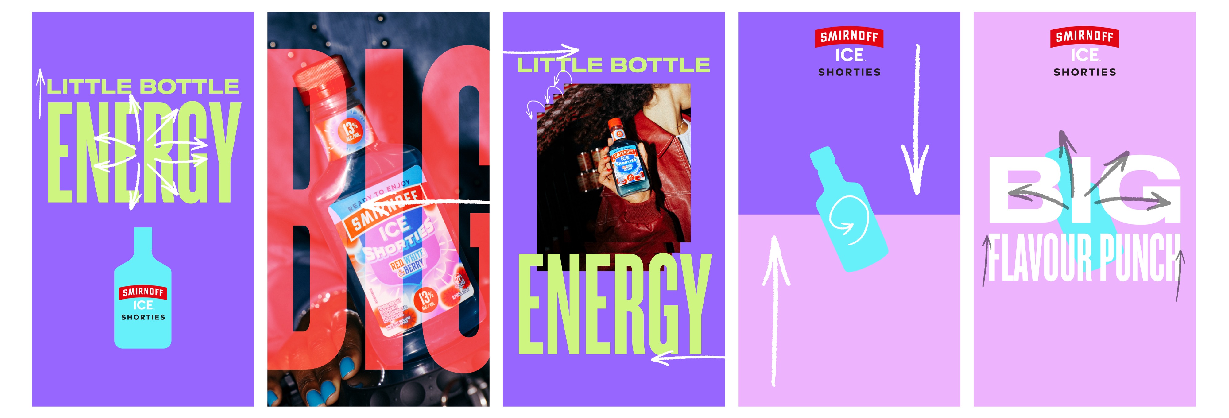
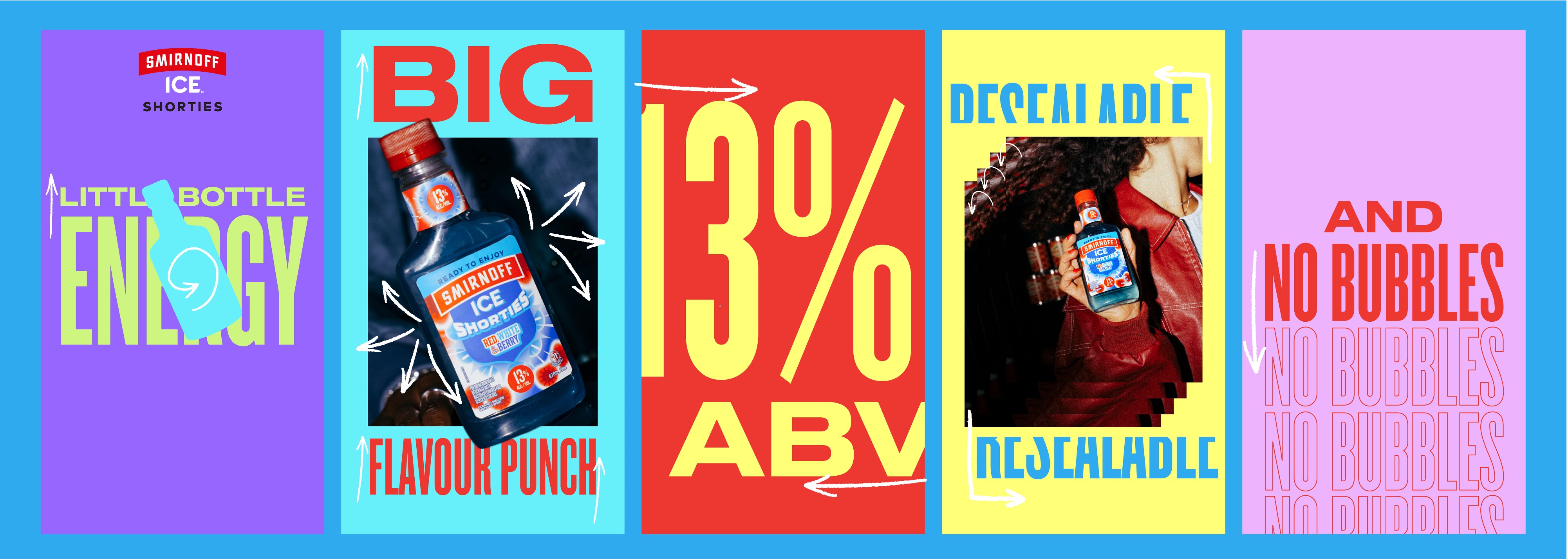
Smirnoff are launching their new product ‘Shorties’ as a direct response to the popularity surge in single-serve, premixed cocktails. They wanted a typography-led reel for socials that would drive awareness of Shorties, and its key USPs.

Key Considerations

Embodying the iconic, confident and vibrant energy of Smirnoff was a key consideration in this brief, leading to my choice to use bold and disruptive colour combinations across each frame. Pace was also a big factor, as we wanted to hook audiences in before that two-second drop off point.

Design Execution

I began by storyboarding some static frames in Illustrator, thinking about what colours I wanted to use from Smirnoff’s extensive brand palette, and how I wanted the reel to flow from start to finish.

After some experimenting with different typographic layouts and potential transitions, I landed on a silhouette of the Shorties bottle as the centre of transitions across the reel. Through zooming and rotating it, it allowed me to move between type-focused frames and images of the product. I also experimented bringing some of the key USPs to life through their type animation – e.g. mimicking the motion of resealing a bottle for the same word, and having the ‘No Bubbles’ messaging repeated in outline as a way of reinforcing it in a fun way.


Mark