
HNE.
Brand identity and social media posts
2021
HNE. is a high-end, honey-based luxury desserts brand that aims to be delicious, nutritious and ambitious in its approach to ethically sourced, natural products. I was asked to design a brand logo and set of social media posts as part of an application task to demonstrate my skills.
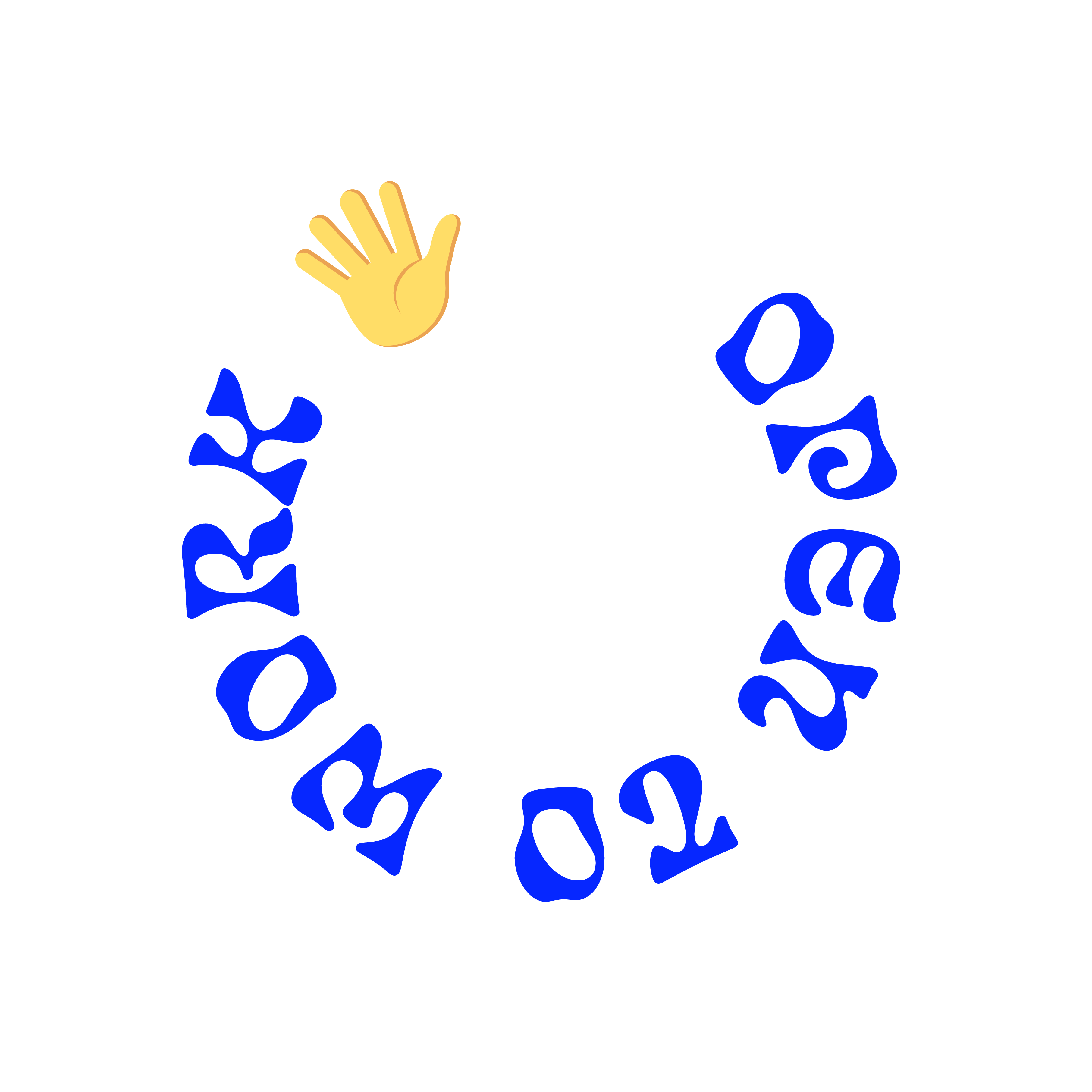
I initially explored a few different logo options before settling on my chosen option - I decided to incorporate the use of the hexagon to represent the hive, where HNE’s product ingredients would be naturally sourced from. I chose the font Sunshine due to its playful, fluid style, which reminded me of the gooey nature of honey. I combined this with the light italic font, Monarch, which I felt gave a more premium feel to the brand. I kept the colours equally high-end for the brand colours, choosing charcoal textures, deep royal blue, and incorporating a molten gold throughout the brand expansion to create the association with golden honey and luxuriousness.
My approach to the social media posts was very typographical, using provocative words such as ‘flavour’, ‘sweet’. ‘gooey’ and ‘gloop’ in the Sunshine brand font, and also in a secondary font, Campfire, which I thought worked well together visually. I also experimented using a 3D honey effect to create words and images that would visually link back to the brand.


