Creative Marketing Council
Branding identity, logo and branding assets2022
As part of a bid within The Tree to design the new branding identity for Creative Marketing Council, we were asked to come up with a logo concept and branded deliverables.
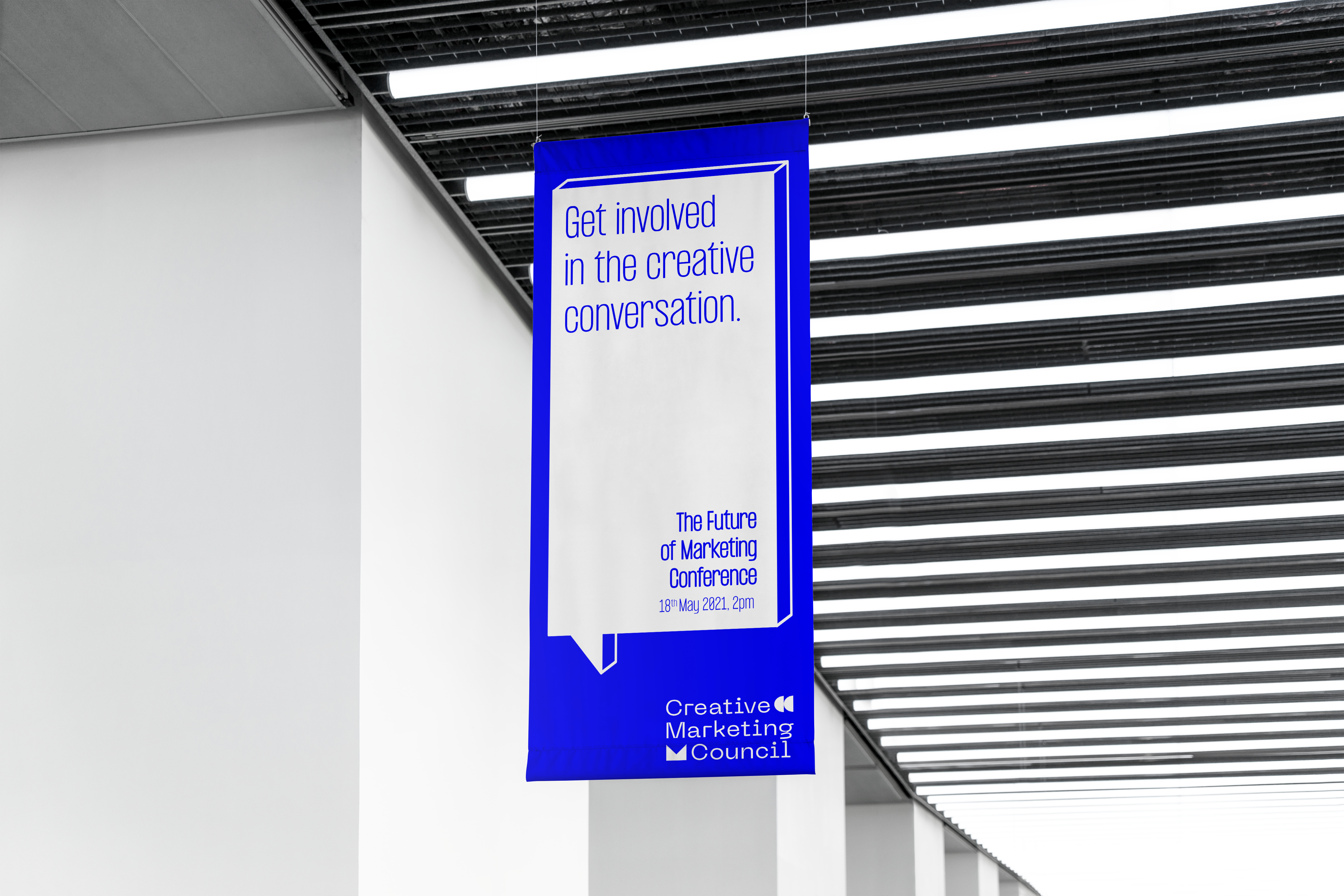
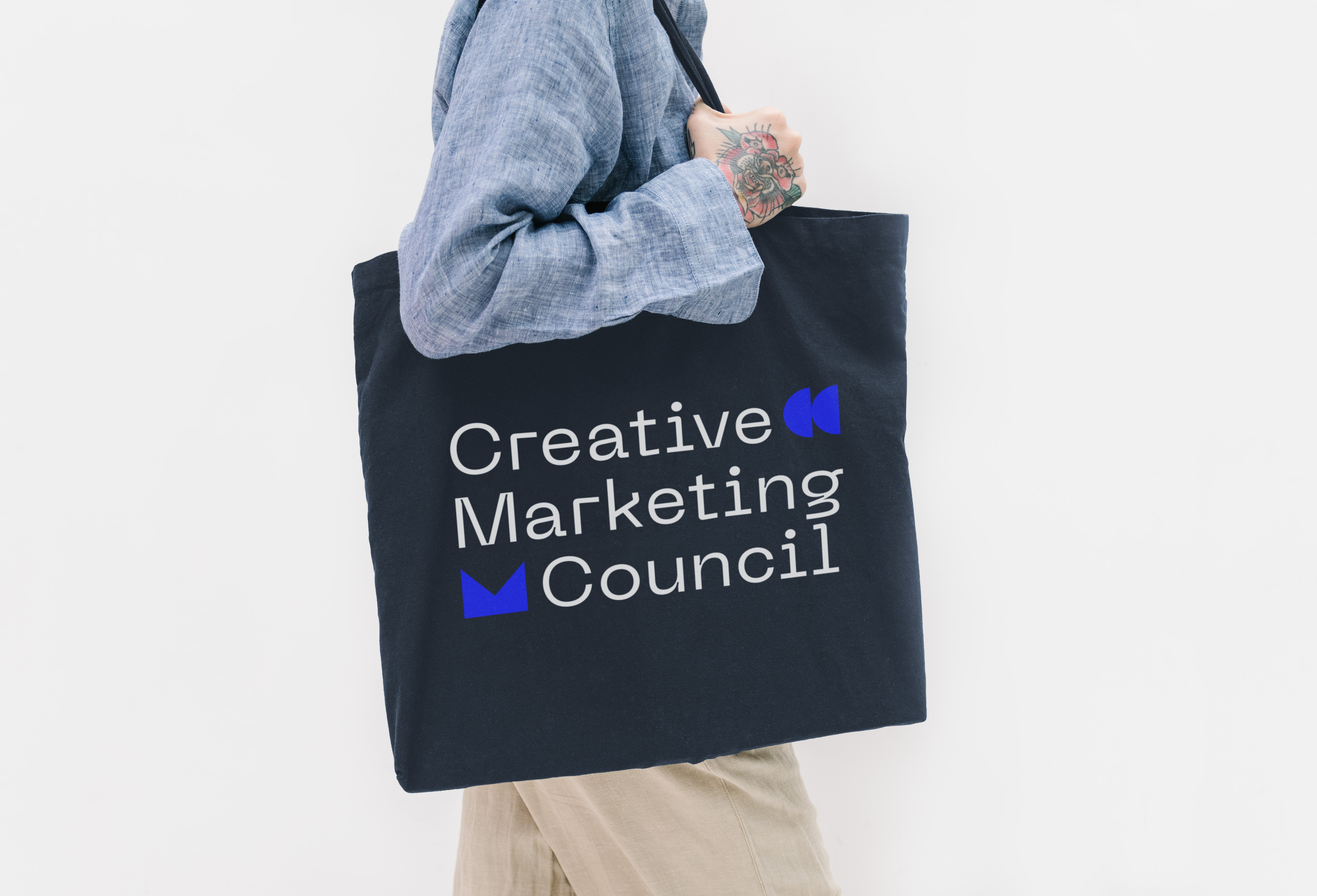
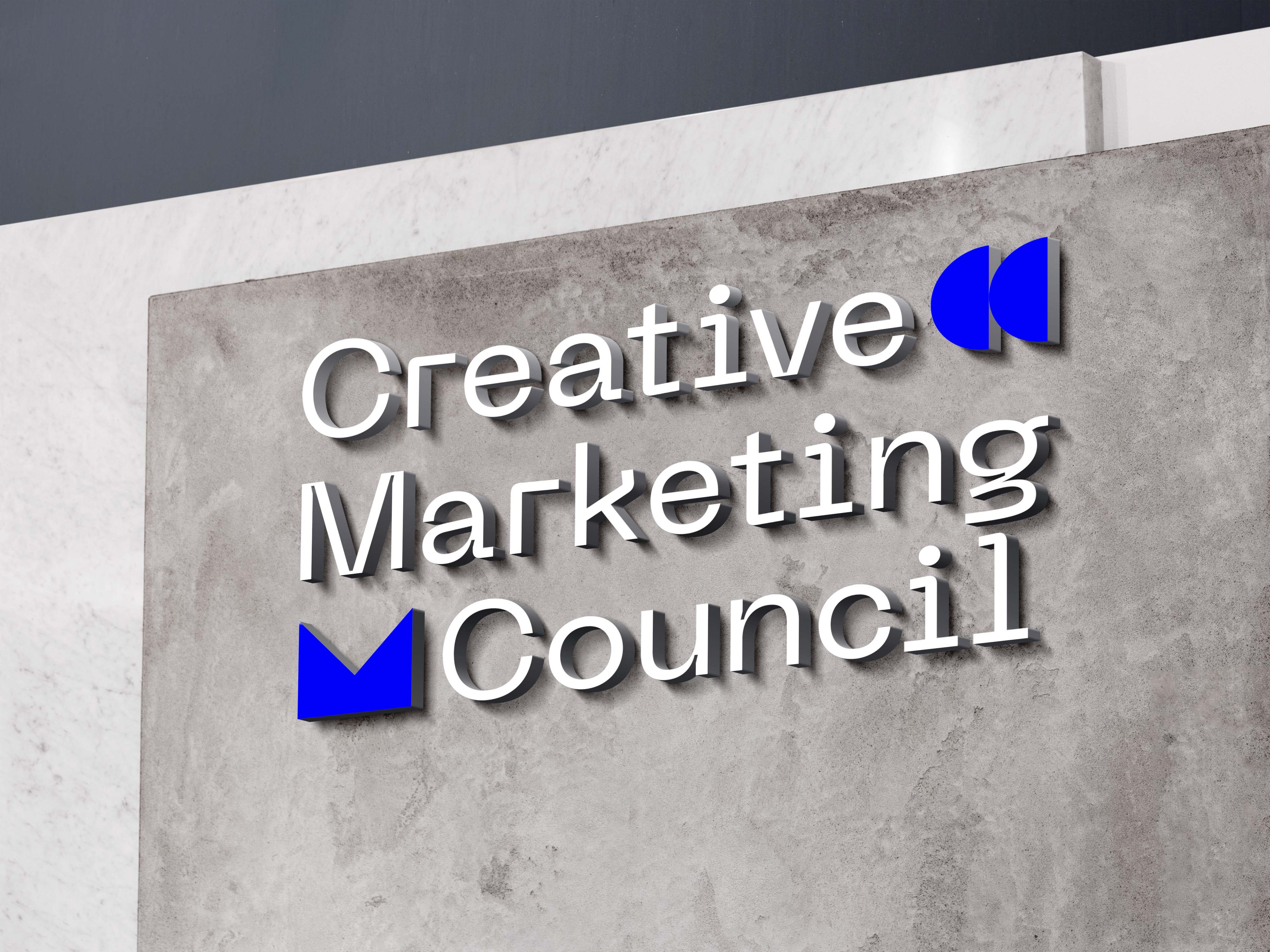
Using shape as the main principle within this design, I created a monogram for ‘CMC’ out of semi-circles and triangles, and combined this with a shape-like font, PP Neue Machina - I wanted the design for the brand to look raw, calling back to original elements and principles of design that we all learn at design school. I also chose to use a dark blue colour as the main brand colour, as I liked how it popped with white, and also its associations with depth and expertise. I expanded this across business cards, merchandise and advertisements for conferences to demonstrate how the brand would work across different deliverables.
Using shape as the main principle within this design, I created a monogram for ‘CMC’ out of semi-circles and triangles, and combined this with a shape-like font, PP Neue Machina - I wanted the design for the brand to look raw, calling back to original elements and principles of design that we all learn at design school. I also chose to use a dark blue colour as the main brand colour, as I liked how it popped with white, and also its associations with depth and expertise. I expanded this across business cards, merchandise and advertisements for conferences to demonstrate how the brand would work across different deliverables.